Rebranding Heritage: Embracing the past, driving into the future
THE BRIEF
CamCab has been providing private hire cars to the Cambridge area since 2004. As a well-known presence in the community and a leading transportation firm with over 150 vehicles, their decision to rebrand was founded on a desire to strengthen their presence in Cambridgeshire further by presenting a cohesive, modern brand by reimagining their current aesthetic to reflect the company’s influence in the local area.
Updating The Logo
As part of the rebranding process, our first task was to create a new logo. After Initial brainstorming activities and research, we first created a selection of variable logo ideas which helped to determine the style of logo that the client favoured. Being well-established in the Cambridge area with a variable audience, the client elected to keep the hat symbol that was part of the original logo and incorporate it into a fresh design.
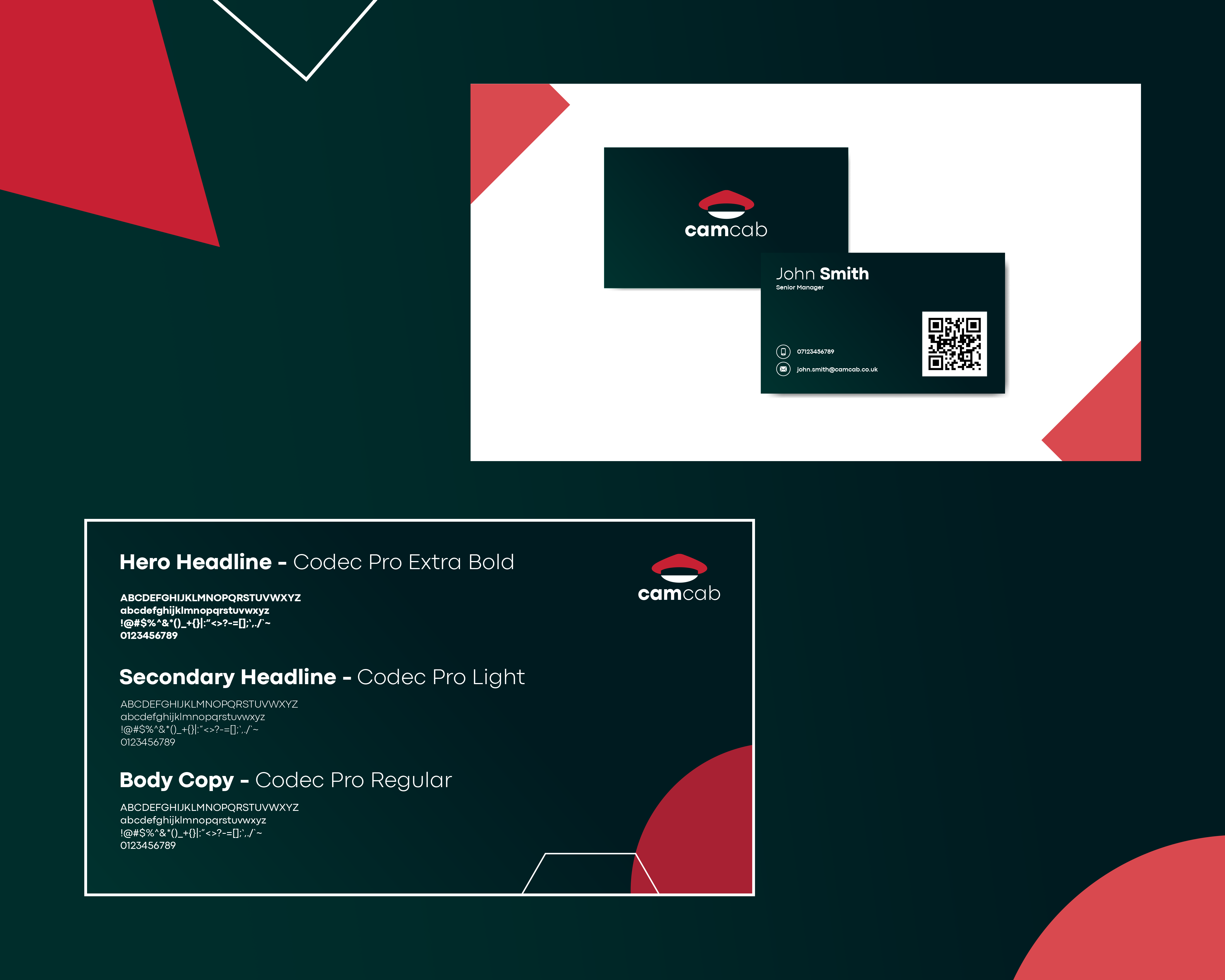
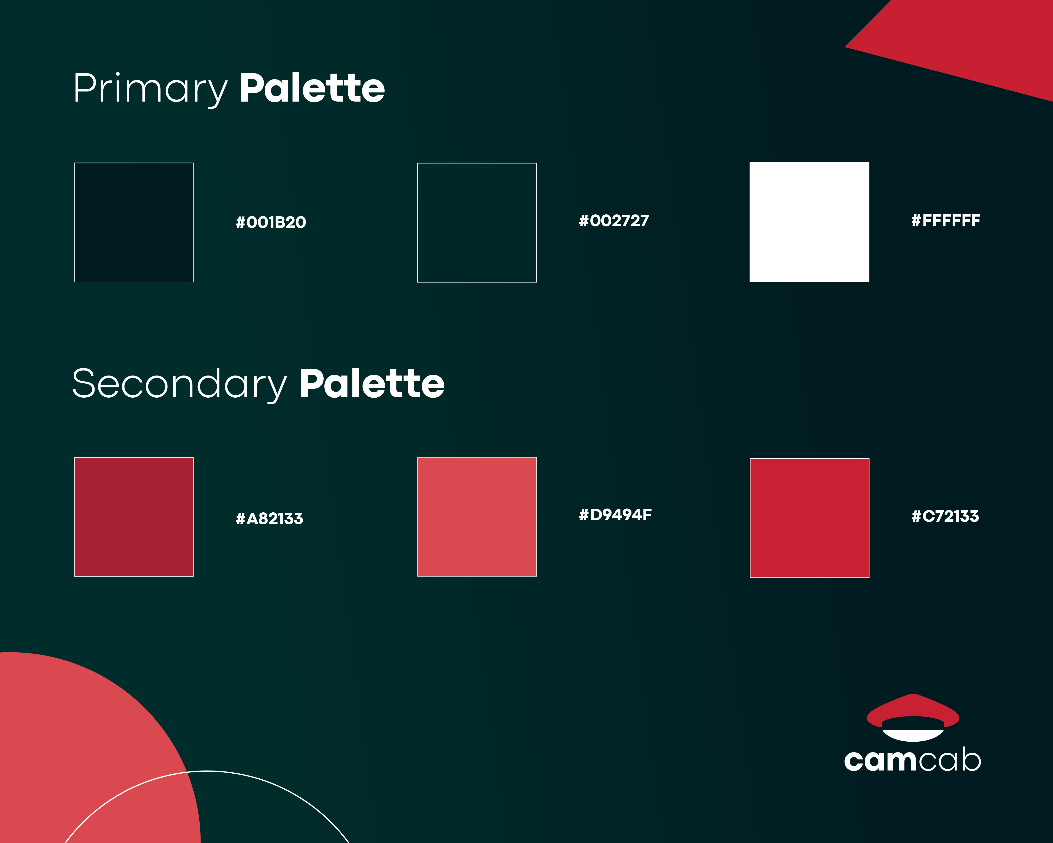
We generated a new colour palette for the logo and chose a classic white primary colour with a red secondary. The colour palette provides a high contrast which means it meets web accessibility guidelines and is also available in black and red for lighter background placement. We chose sans serif font ‘Codec Pro’ as it both translates particularly well for web usage, and its bold appearance helped to balance the timeless look of the hat icon with a modern edge.
“When designing this rebrand, it was crucial for us to create a visual identity that not only honours CamCab’s long standing presence in Cambridge, but also positions the company for future growth and innovation. We wanted to seamlessly blend tradition and modernity, celebrating the rich history that shaped the firm over the past 20 years while helping to drive the company into the next decade, and beyond.”
Brand Guidelines
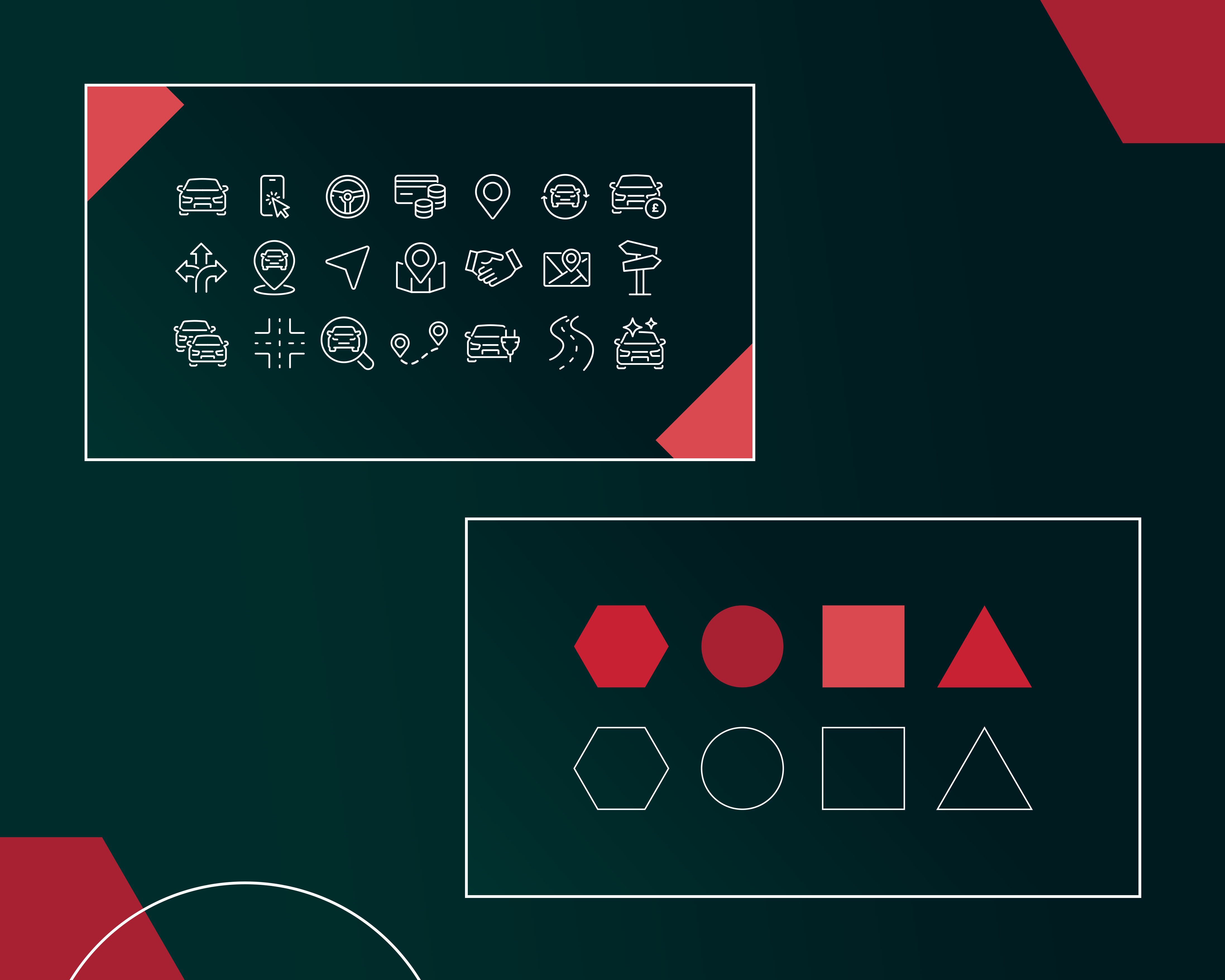
The brand guidelines presented a key part of the rebrand. Continuing the use of ‘Codec Pro’ in keeping with the logo design, we mapped out the guidelines in sections covering the colour palette, typography, iconography, graphic elements, photography and so on. The guide serves to create an informative and invaluable tool to keep all aspects of the company cohesive and on-brand.
Due to CamCab’s interest in environmentally friendly solutions in transportation, and ties to Cambridge’s historic low-rise setting, we felt that a dark heritage green portrayed both the environmental interest while also paying homage to the green landscape Cambridgeshire is known for. We also added a dark subtle gradient to help the green contrast with the informal geometric shapes also incorporated into the brand.
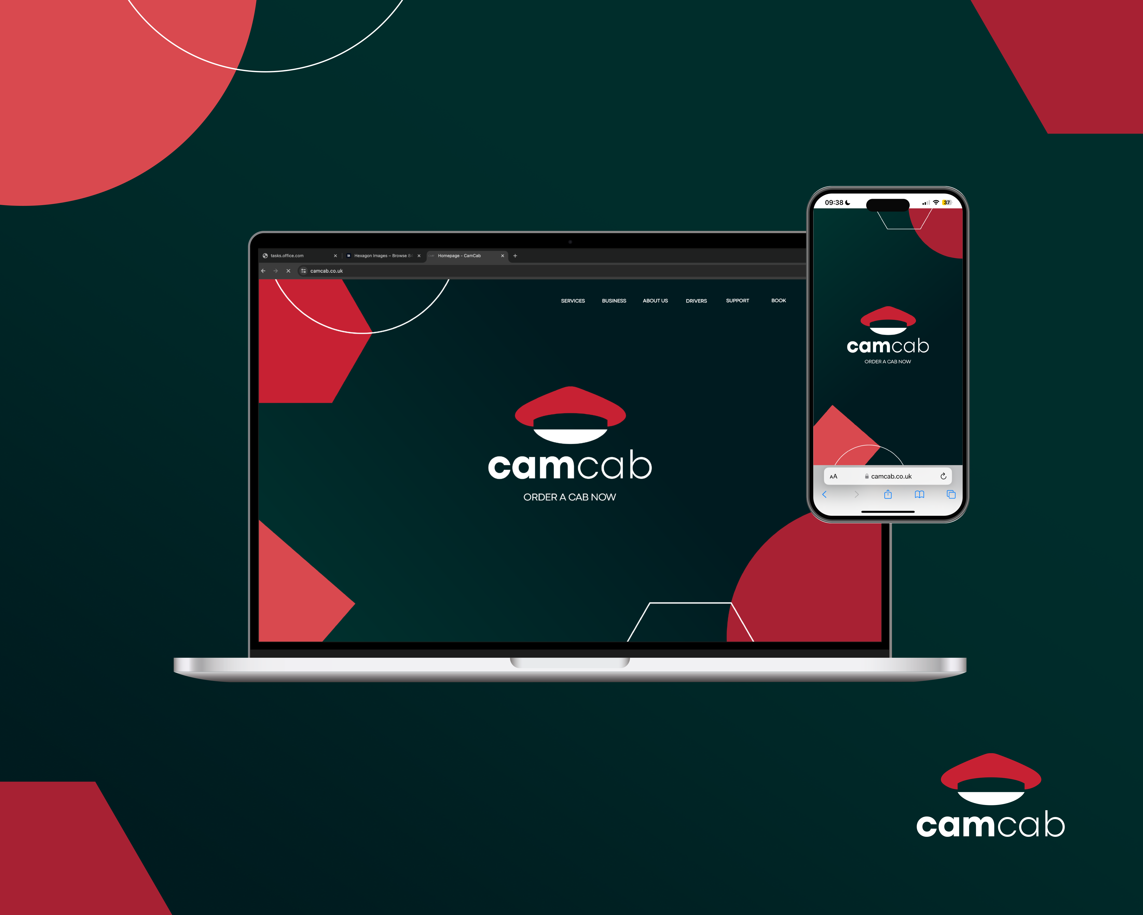
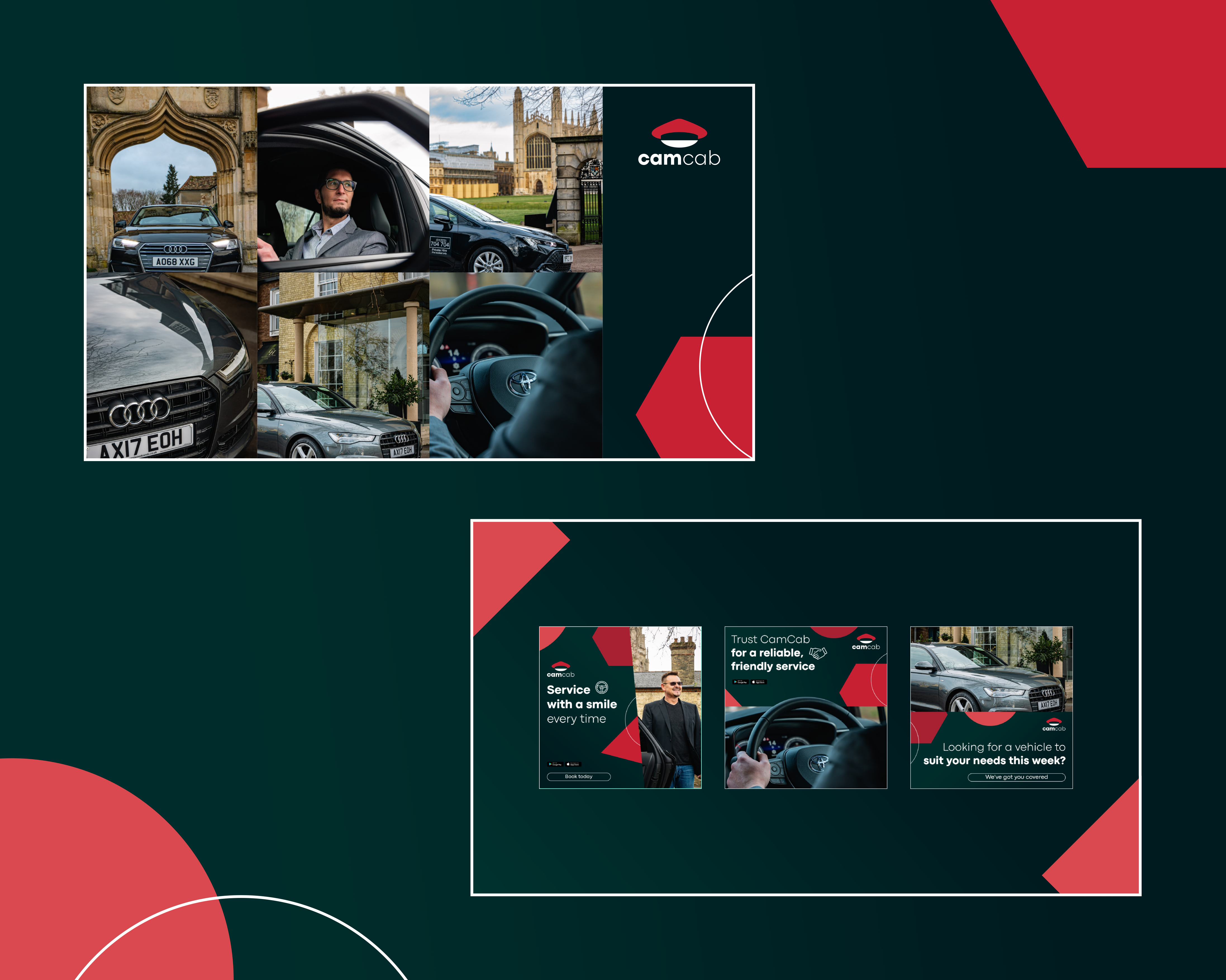
Mock-ups of various printed assets such as business cards, receipts and car signage helped to portray the new brand in a real-life setting and also mapped out suggested assets that needed to be updated as part of the brand overhaul. We also created web concepts in the new branding such as the CamCab website homepage, as well as an app related concept.
The Outcome
The sympathetic take on this rebrand aimed to bring the CamCab brand up to date for a younger student-based audience while maintaining its heritage within the general Cambridge community. As a well-known brand in the area the client was keen for these two values to harmonise into the united concept that is seen in the brand today. The outcome illustrates how old and new converge to create a brand that acknowledges its past while appealing to its present and successfully communicates the client’s vision resulting in a strengthened identity that will keep the CamCab brand relevant for years to come.